[반응형 웹] 7.Flex Layout
in Web on Responsive_Web

flex-Layout
다음은 flex 속성을 이용하여 반응형 웹 레이아웃을 만든 것입니다!
<!doctype html>
<html lang="en">
<head>
	<meta charset="UTF-8">
	<title>Document</title>
	<style>
		*{margin:0; padding:0; box-sizing:border-box;}
		.wrap{display: flex; /* display: flex */
			flex-wrap:wrap; /* 자동 개행 */
		}
		.wrap>div{display: flex;
			justify-content:center;
			align-items:center;}
		.header{background: #eff;
			height:10vh; /* RWD Viewport: https://www.w3schools.com/css/css_rwd_viewport.asp*/
			flex:1 100%; /* width를 100% 채워줌 */

		}
		.main{background: #ffb3b3;
			height:75vh;
			flex:1 100%;
		}
		.ad{background: #ecb3ff;
			height:5vh;
			flex:1 50%;
		}
		.info{background: #b3ecff;
			height:5vh;
			flex:1 50%;
		}
		.footer{background: #b3ffd9;
			height:10vh;
			flex:1 100%;
		}

		@media only screen and (max-width: 768px){
			.header{
				flex: 1 80%;
			}
			.ad{
				height:10vh;
				flex:1 20%;
				order:1;
			}
			.main{ order:2;
				height:70vh;}
			.info{background: #b3ecff;
				height:10vh;
				flex:1 100%;
				order:3;
			}
			.footer{
				order:4;
			}
		}

		@media only screen and (min-width: 768px)and (max-width:1200px){
			.header{
				flex: 1 100%;
			}
			.ad{
				flex:1 20%;
				order:1;
				height:80vh;
			}
			.main{ order:2;
				flex:1 60%;
				height:80vh;}
			.info{
				height:10vh;
				flex:1 20%;
				order:3;
				height:80vh;
			}
			.footer{
				order:4;
			}
		}

		@media only screen and (min-width: 1200px){

		}

	</style>
</head>
<body>
	<div class="wrap">
		<div class="header">
			<p>헤더</p>
		</div>
		<div class="main">
			<p>메인</p>
		</div>
		<div class="ad">
			<p>광고</p>
		</div>
		<div class="info">
			<p>정보</p>
		</div>
		<div class="footer">
			<p>푸터</p>
		</div>
	</div>
</body>
</html>
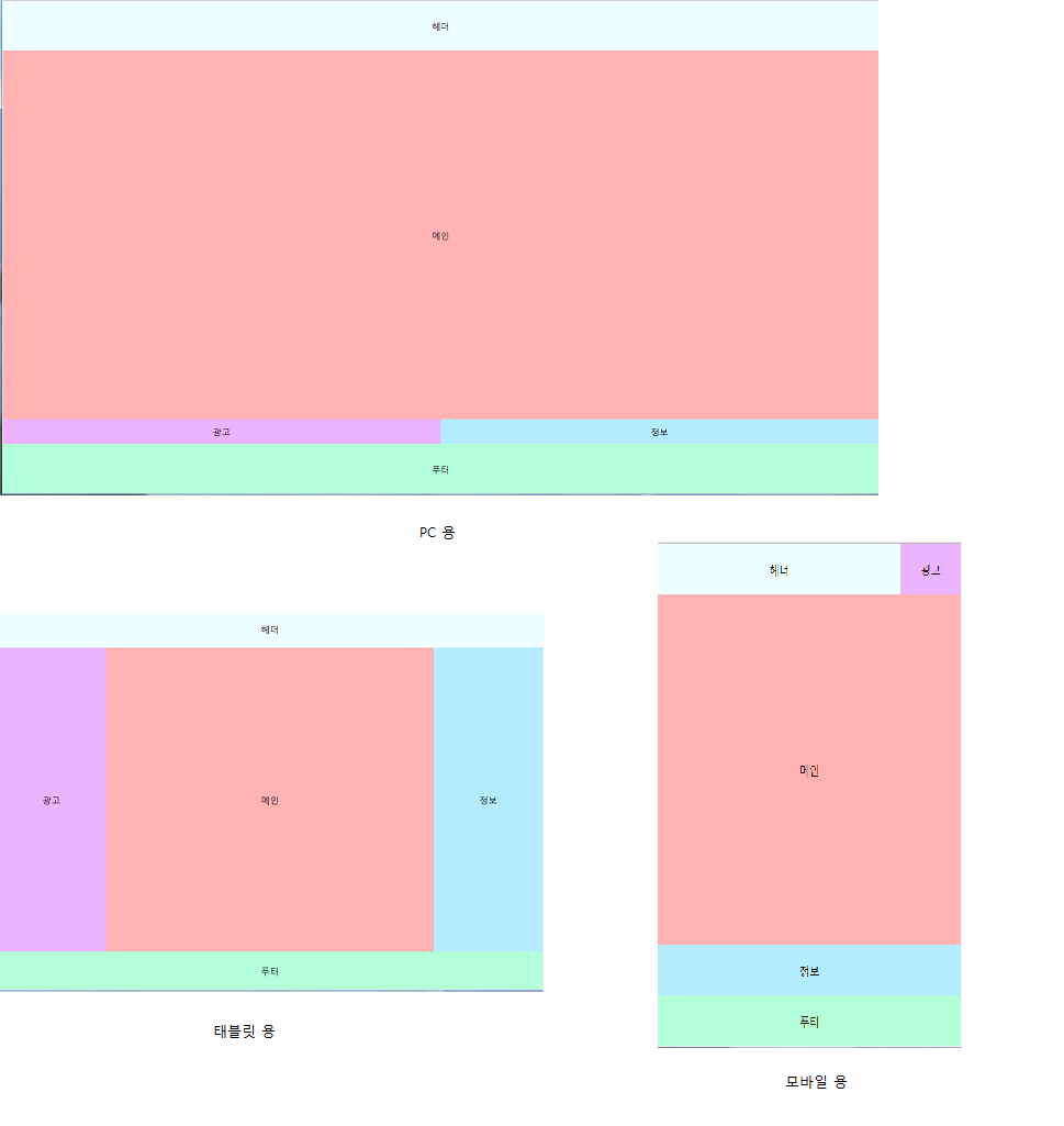
실행결과

배움은 의무도 생존도 아니다