[반응형 웹] 6.Flex(2)
in Web on Responsive_Web

flex-자식 속성
전 장에 이어서 flex 속성에 대해 알아보겠습니다.
전 장에서는 flex에 관한 속성 flex-direction, flex-wrap 등을 부모 container에 추가했습니다.
이번 장에서는 자식에 추가되는 flex 속성에 대해 알아보겠습니다.
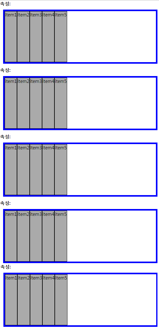
예제에 앞서 다음과 같이 미리 셋팅해 놓겠습니다.
<!doctype html>
<html lang="en">
<head>
	<meta charset="UTF-8">
	<title>flex</title>
	<style>
		*{
			margin:0; padding:0;
			box-sizing:border-box;
		}
		h1{
			font-size:15px;
			margin-bottom:10px;
		}
		.con{
			border:5px solid #00f;
			width:30%;
			margin:10px;
			height:175px;
            display: flex; /* flex 로 선언 */
		}
		.con p{
			border:1px solid #000;
			font-size:15px;
			text-align:center;
			background: #aaa;
		}


	</style>
</head>
<body>
		<h1>속성: </h1>
		<div class="container1 con">
			<p>item1</p>
			<p>item2</p>
			<p>item3</p>
			<p>item4</p>
			<p>item5</p>
		</div>
		<h1>속성: </h1>
		<div class="container2 con">
			<p>item1</p>
			<p>item2</p>
			<p>item3</p>
			<p>item4</p>
			<p>item5</p>
		</div>
		<h1>속성: </h1>
		<div class="container3 con">
			<p>item1</p>
			<p>item2</p>
			<p>item3</p>
			<p>item4</p>
			<p>item5</p>
		</div>
		<h1>속성: </h1>
		<div class="container4 con">
			<p>item1</p>
			<p>item2</p>
			<p>item3</p>
			<p>item4</p>
			<p>item5</p>
		</div>
		<h1>속성: </h1>
		<div class="container5 con">
			<p>item1</p>
			<p>item2</p>
			<p>item3</p>
			<p>item4</p>
			<p>item5</p>
		</div>
</body>
</html>
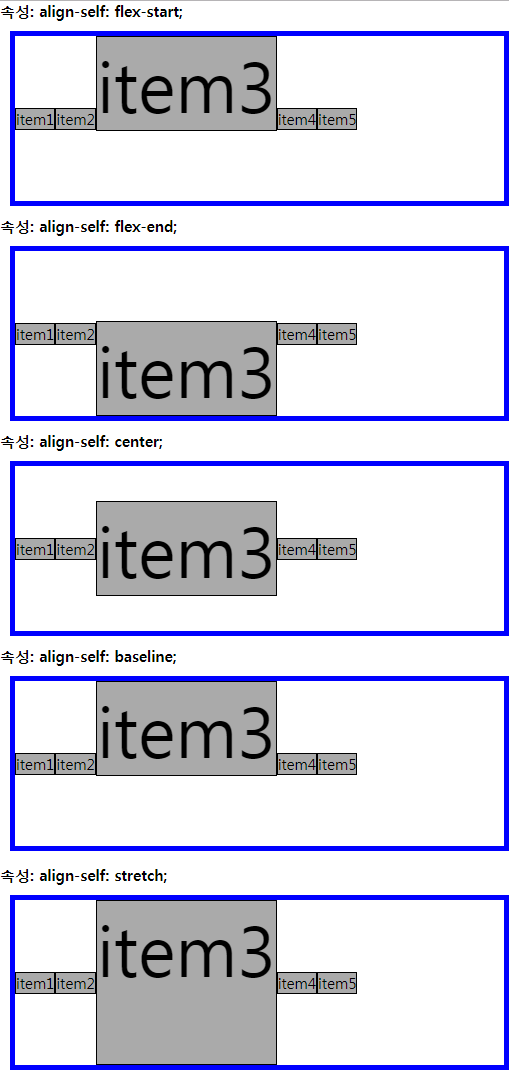
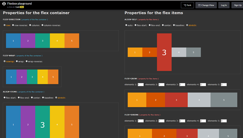
ALIGN-SELF
ailgn-self는 지정된 align-items 값을 무시하고 flex 요소를 세로선 상에서 정렬합니다.
속성 값은 다음과 같습니다.
- flex-start: 요소들을 컨테이너의 꼭대기로 정렬합니다.(기본 값)
- flex-end: 요소들을 컨테이너의 바닥으로 정렬합니다.
- center: 요소들을 컨테이너의 세로선 상의 가운데로 정렬합니다.
- baseline: 요소들을 컨테이너의 시작 위치에 정렬합니다.
- stretch: 요소들을 컨테이너에 맞도록 늘립니다.
.con{
	display: flex;
	align-items:center;
}

.con p:nth-child(3){
	font-size:70px;
}

.container1 p:nth-child(3){
	align-self: flex-start;
}

.container2 p:nth-child(3){
	align-self: flex-end;
}

.container3 p:nth-child(3){
	align-self: center;
}

.container4 p:nth-child(3){
	align-self: baseline;
}

.container5 p:nth-child(3){
	align-self: stretch;
}
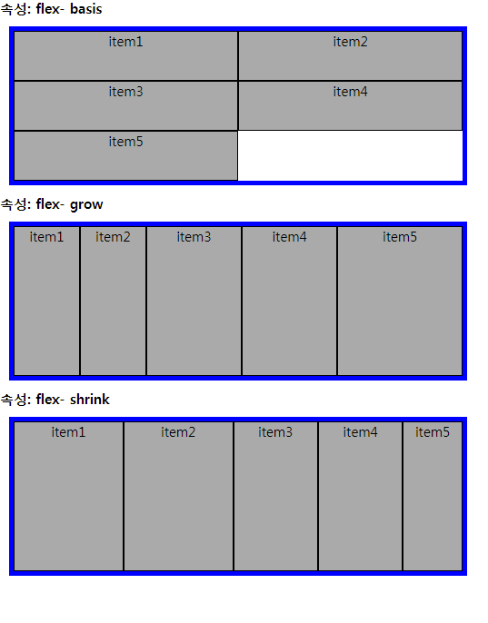
FLEX- BASIS, GROW, SHRINK
flex-basis, flex-grow, flex-shrink 는 flex 요소의 너비에 관련된 속성입니다!
- flex-grow : flexible item들이 차지할 너비들에 대한 증가형 숫자를 지정한다.
- flex-shrink : flexible item들이 차지할 너비들에 대한 감소형 숫자를 지정한다. (단, 공간이 모자르지 않으면 수축하지 않는다.)
- flex-basis : item의 길이를 지정한다.
.con{
	display: flex;
}

/* flex- basis 예제 */

.container1{
	flex-wrap:wrap;
}
.container1 p{
	flex-basis: 50%;
}

/* flex- grow 예제 */
.container2 p:nth-child(1){
	flex-grow:1;
}
.container2 p:nth-child(2){
	flex-grow:1;
}
.container2 p:nth-child(3){
	flex-grow:2;
}
.container2 p:nth-child(4){
	flex-grow:2;
}
.container2 p:nth-child(5){
	flex-grow:3;
}

/* flex- shrink 예제 */
.container3 p{
	flex-basis:30%;
}
.container3 p:nth-child(1){
	flex-shrink: 1;
}
.container3 p:nth-child(2){
	flex-shrink: 1;
}
.container3 p:nth-child(3){
	flex-shrink: 2;
}
.container3 p:nth-child(4){
	flex-shrink: 2;
}
.container3 p:nth-child(5){
	flex-shrink: 3;
}
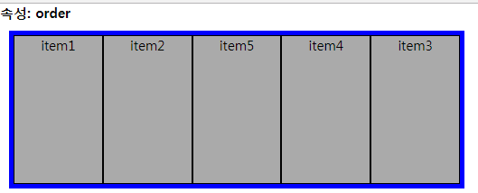
order
order는 flex 요소의 순서를 정해주는 속성입니다.
.con{
	display: flex;
}

/*order 예제 */
.container1 p{
	flex-grow:1;
}
.container1 p:nth-child(1){
	order:1;
}
.container1 p:nth-child(2){
	order:2;
}
.container1 p:nth-child(3){
	order:5;
}
.container1 p:nth-child(4){
	order:4;
}
.container1 p:nth-child(5){
	order:3;
}
FLEX 관련 사이트
지금까지 flex 속성에 대해 알아봤는데요!
flex를 사용하면 레이아웃을 좀 더 간편하게 만들 수 있습니다
flex에 관한 좋은 사이트도 많이 있는데요~
다음 사이트들을 추천합니다!

배움은 의무도 생존도 아니다