[CSS] 12. Position
Position
position은 블록을 박스의 위치기준으로 배치하는 기술로서,
주로 컨텐츠를 서로 겹치게 배열하거나 마크업 순서와 디자인 상의 순서가 다를 경우의 표현에 매우 유용합니다.
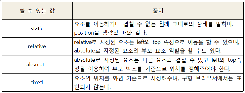
position은 absolute와 relative가 중요하며,
다른 요소와 겹쳐져야 하거나 또는 제이쿼리로 애니메이션 해야한다면
absolute여야 합니다.
또한, absolute 요소의 부모 박스 역할을 하거나 그냥 살짝 이동만 할거라면 relative를 사용합니다.
예제를 보시죠!
<!doctype html>
<html lang="ko">
<head>
	<meta charset="UTF-8">
	<title>position 속성 연습</title>
	<style>
		.content{margin:50px; width:600px; height: 600px;
        	border:1px solid #000;}
		.c{width:100px; height:100px;border:1px solid #000;}
		.con1{background: yellow;}
		.con2{background: skyblue;}
		.con3{background: pink;}
		.con4{background: red;}
		.con5{background: orange;}
	</style>
</head>
<body>
<div class="content">
	<div class="con1 c">
		<p>꾸리블로그 position 테스트1</p>
	</div>
	<div class="con2 c">
		<p>꾸리블로그 position 테스트2</p>
	</div>
	<div class="con3 c">
		<p>꾸리블로그 position 테스트3</p>
	</div>
	<div class="con4 c">
		<p>꾸리블로그 position 테스트4</p>
	</div>
	<div class="con5 c">
		<p>꾸리블로그 position 테스트5</p>
	</div>

</div>
</body>
</html>
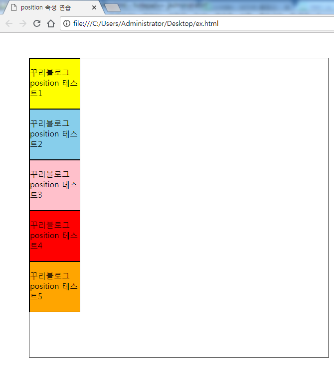
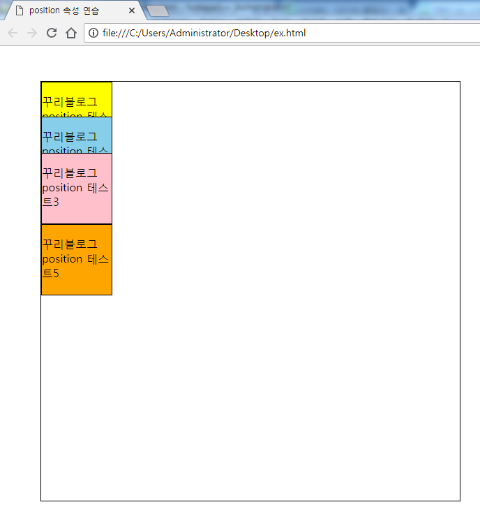
일단, position 속성을 적용하기 전 초기상태입니다!
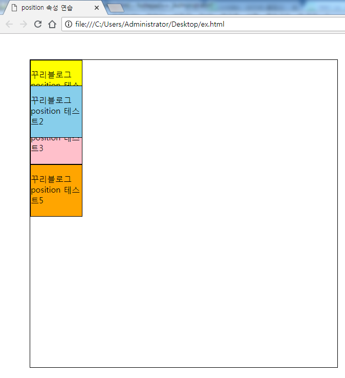
여기서 다음과 같이 con2와 con3에 position:absolute;를 추가해보죠!
.con2{position:absolute; background: skyblue;}
.con3{position:absolute; background: pink;}
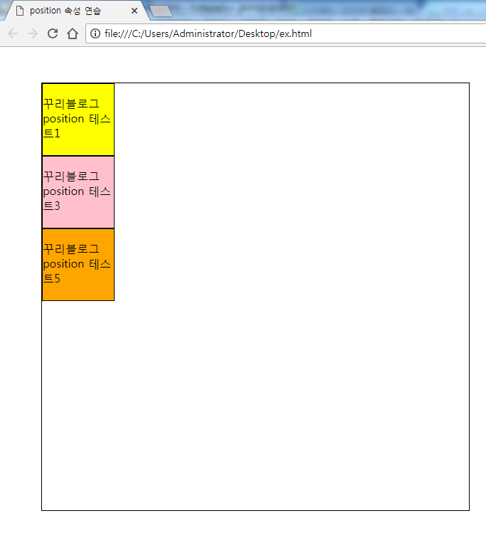
와우! con3이 con2에 겹쳐지고 con4가 con3에 겹쳐지는 것을 볼 수 있습니다!(현재 con2,con3,con4 같은 위치)
absolute 요소는 이렇게 위치 값을 주지않으면 제멋대로 자리 잡습니다!
그렇다면 con2 요소를 top을 이용해서 con1과 con3 중앙에 위치시켜보겠습니다.
.con2{position:absolute; background: skyblue; top:50px;}
앗 그런데 우리가 원하는 결과가 아니네요?
이것은 con2를 position:absolute; 했을 때 부모를 지정해주지 않았기에
부모를 body로 인식하고, body 좌측 상단을 0,0을 기준으로 배치했기 때문입니다.
이 때 con2의 진짜 부모인 content에 position:relative;를 추가해야합니다.
.content{position:relative; margin:50px; width:600px;
	height: 600px; border:1px solid #000;}
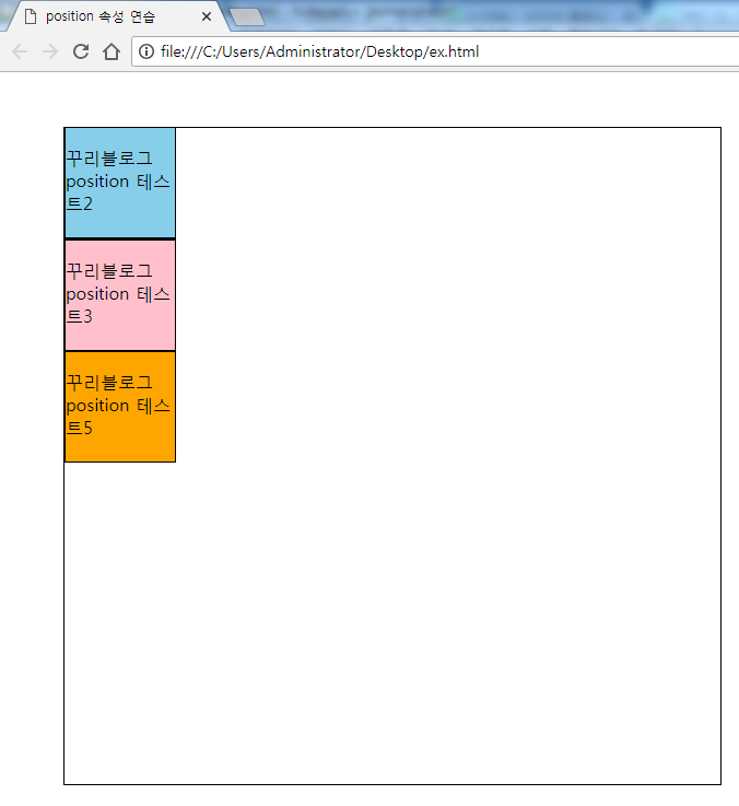
결과를 보면 위치는 이제 된 것 같은데, con2를 제일 위로 보이게 하고싶습니다!
이 때는 z-index를 사용해서 우선순위를 지정해주어야합니다!
.con1{background: yellow; z-index:1;}
.con2{position:absolute; background: skyblue;
	top:50px; z-index:2;}
.con3{position:absolute; background: pink; z-index:1;}
제대로 된 결과가 나왔습니다!
정리하면, position:absolute; 로 박스들을 겹치게 할 수 있는데,
부모에 position:relative;를 안해주면, body를 부모로 인식한다는 것이고,
top과 left를 이용해서 원하는대로 박스를 위치시킬 수 있습니다.
또한 z-index를 가지고, 어떤 것이 우선적으로 보일지 정할 수도 있습니다!
그럼 con3 뒤에 숨어있는 con4도 꺼내볼까요?
.con4{position:absolute; background: red; top:150px;
	left:50px; z-index:3;}
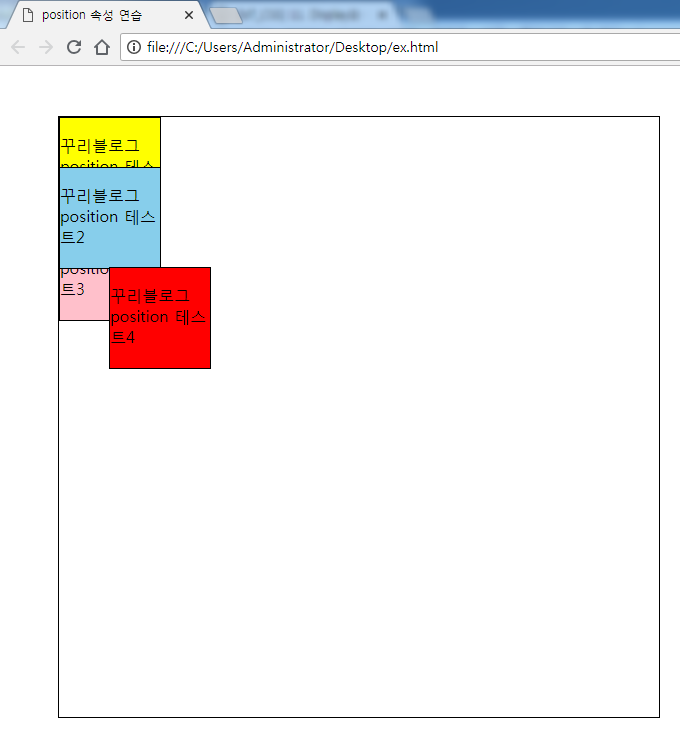
우와우 con5 어디로 갔죠? con3 밑으로 들어가버렸습니다!
con5를 아까 위치로 되돌리려면 con5도 position:absolute; 하고,
top을 지정해서 옮기면 됩니다!
또 다른 방법도 있습니다.
con5에 position:relative;를 추가해보죠!
.con5{position:relative; background: orange; top:100px; }
그러면 con5는 현재 자기 위치를 기준으로 이동합니다!
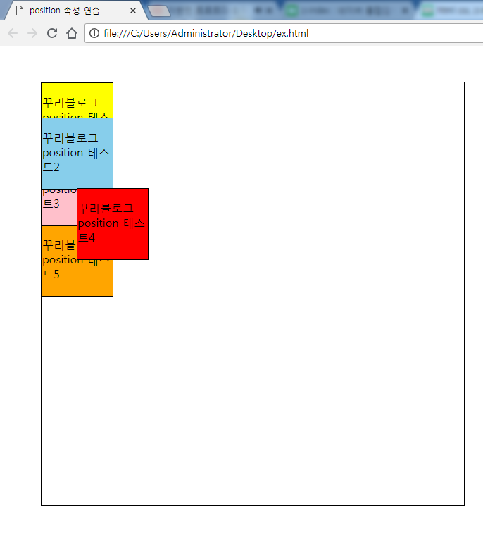
드디어 원하는 결과가 나왔습니다!
부모가 아닌 자기 자신에 position:relative; 을 했을 때 다른 박스가 영향을 받지 않는걸 볼 수 있습니다.
즉, absolute와 relative는 완전히 다른 속성입니다.
또 position: relative;는 자신의 공간은 그대로 차지한채로 움직입니다~!
<주의>


position:relative; 와 float: left; 는 같이 쓸 수 있다.

-> 둘 다 주변과 어울리게 해준다.


position:absolute;와 float:left; 는 같이 쓸 수 없다.

->absolute는 어울림의 반대, 즉 따로 떨어져 나온 독립된 요소이기에

부모 박스가 자동으로 감싸주지 않는다.
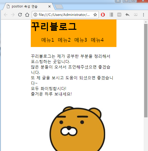
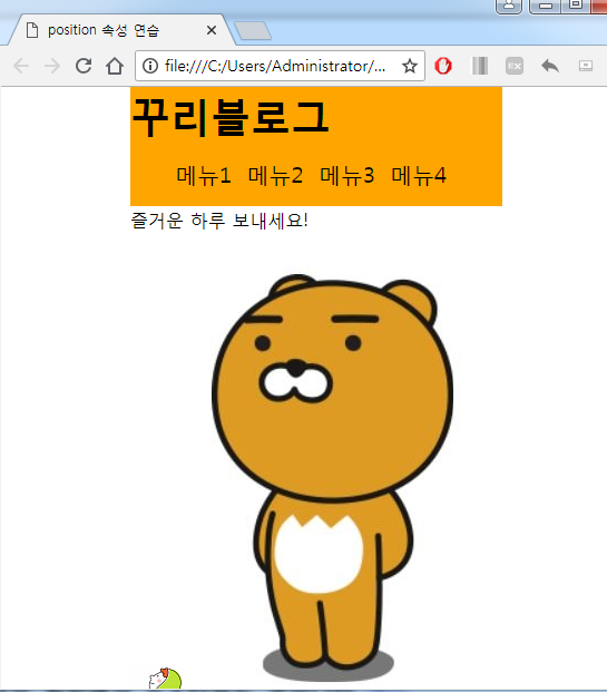
fixed를 이용한 화면 일부분에 고정된 박스 만들기
position:fixed; 를 이용하면, 화면이 움직였을 때도 고정되는 박스를 만들 수 있습니다.
예제를 보시죠!
<!doctype html>
<html lang="ko">
<head>
	<meta charset="UTF-8">
	<title>position 속성 연습</title>
	<style>
		.wrap{width:60%; margin:auto;  }
		.header{margin:0; width:60%; margin-bottom:30px; background: orange; position:fixed; top:0; }
		.header h1{font-size:36px; margin:0;}
		.header ul li{width:20%; font-size:20px; list-style:none; display:inline-block; }
		.content{padding-top:107px}
	</style>
</head>
<body>
<div class="wrap">
	<div class="header">
		<h1>꾸리블로그</h1>
		<div class="nav">
			<ul>
				<li>메뉴1</li>
				<li>메뉴2</li>
				<li>메뉴3</li>
				<li>메뉴4</li>
			</ul>
		</div>
	</div>
	<div class="content">
		<p>꾸리블로그는 제가 공부한 부분을 정리해서 포스팅하는 곳입니다.<br>
		많은 분들이 오셔서 조언해주셨으면 좋겠습니다. <br>
		또 제 글을 보시고 도움이 되셨으면 좋겠습니다~<br>
		모두 화이팅합시다!<br>
		즐거운 하루 보내세요!</p>
		<img src="C:\Users\Administrator\Desktop\img.png" alt="">
		<img src="C:\Users\Administrator\Desktop\img2.png" alt="">
	</div>


</div>
</body>
</html>

배움은 의무도 생존도 아니다